


By Katherine Beaty
Last month, I wrote about what I call the Behavior Gap, the distance between how parking systems assume customers will behave and how they actually do. The short version: Your customers are distracted, rushed, and making micro-decisions under pressure. Most parking systems were designed for someone who isn’t experiencing these conditions. That disconnect is where violations, complaints, and lost revenue quietly accumulate.
This month, I want to move past the diagnosis and into the prescription. The good news is that closing the Behavior Gap doesn’t require new technology, a new vendor, or a request for proposals. It requires a different kind of attention to what you already have.
Think about the last time you walked into a grocery store you’d never visited before. You still knew exactly what to do. The cart was near the entrance. The aisles had signs. Checkout was at the front. You navigated on autopilot because grocery stores follow a shared script, that is, a mental model customers have known since childhood.

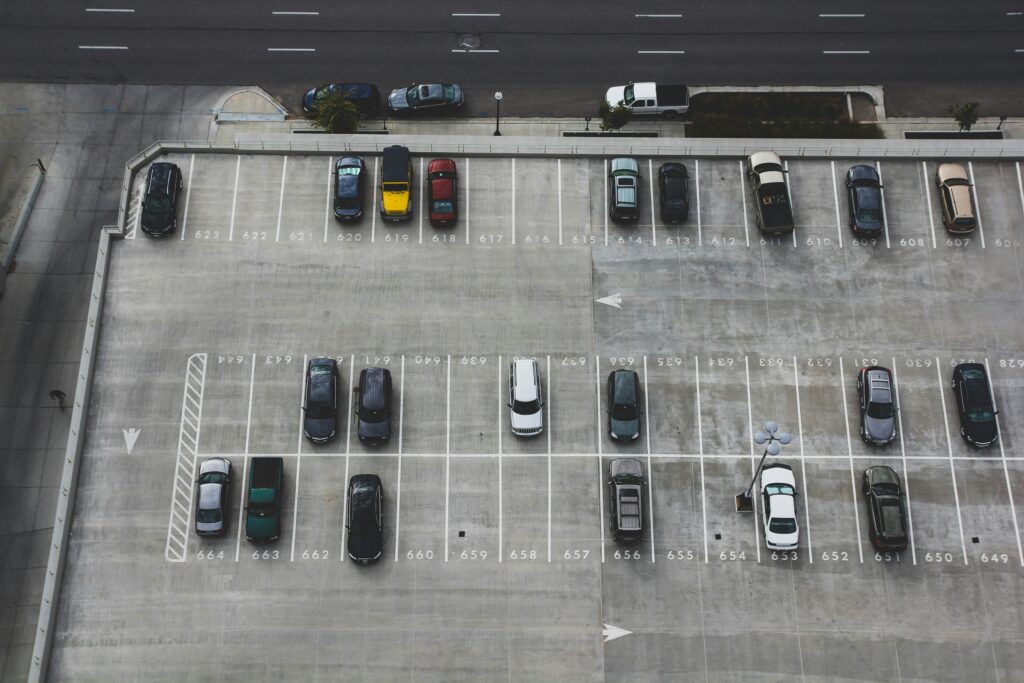
Parking has no shared script. Walk into five different facilities in the same city, and you might encounter five different payment systems, five different signage conventions, and five different enforcement models. Every unfamiliar lot is a problem for customers to solve from scratch, at the exact moment they are most distracted. That’s not a complaint about the industry; it’s a design reality we have to work with. And once you see it, you start to identify the opportunities.
Start with reduction
The most consistent finding in my operational reviews is this: Most systems don’t need to be smarter. They need to be more intuitive.
Every additional choice point in a payment flow is a source of friction. Every extra line of text on a sign is a cognitive tax. When customers are overloaded, by too many options, too many messages, or too many steps, they don’t engage more carefully. They guess, they skip steps, or they give up entirely. The resulting violations and complaints aren’t defiance. They’re the predictable output of a system that asked too much at the wrong moment.
The fix isn’t more information. It’s less. One clear call to action. One primary path. The question to ask about every customer touchpoint isn’t, “What do we want them to know?” It’s, “What is the minimum they need to do the right thing?”
Here’s an exercise I’ve given to operators more than once: If you had to remove half of your signage tomorrow, which half would you keep? Most people can answer that quickly. The answer reveals which signs are doing real work and which are clutter. That instinct toward the essential is exactly the right one to follow.
Redesign for the moment of decision
Reduction is the starting point, but it must be paired with proper placement. The right message at the wrong moment is almost as useless as no message at all.
Don’t provide information simply when and where it’s convenient for you to do so. Think about when your customer actually needs information:
• At the entrance
• On the website
• In the terms and conditions
• At the meter
• When walking back to their car
• When receiving a notice
Right-time communication means delivering the right cue at the exact decision point, in plain language, with one clear action intended.
Visual cues matter enormously here. A well-designed physical environment, painted zones, clear demarcation, and intuitive wayfinding can do more to ensure compliance than three additional signs. When the right behavior is visually obvious, customers don’t have to read and interpret. They just follow the path. That’s the goal.
Short instructions in plain language. One primary action per communication. Visual reinforcement at the point of decision. These aren’t design luxuries; they’re the baseline for a system that works with how people actually make decisions.
Build in a recovery path
Even a well-designed system will produce mistakes. That’s not a failure of design; it’s human nature. The question is whether your system gives customers a graceful way out, or whether a single misstep cascades into a citation, a complaint, and a lost customer.
I think about this in terms of what I call the “recovery experience.” What happens in the moments after something goes wrong. Can the customer correct a payment error without calling anyone? Is the appeal process clear and accessible, or buried and adversarial? When enforcement staff encounter a genuinely confused customer, do they have the tools and discretion to resolve it quickly?
The moments that matter most to a customer’s impression of your operation are almost never the routine ones. They’re the moments when something went sideways. A smooth recovery (fast, clear, and humane) can actually improve a customer’s perception relative to baseline. A punishing or confusing recovery confirms every negative assumption they already had about parking.
This is high-leverage territory. And it costs less than most operators expect.
Measure what the gap is costing you
One reason the Behavior Gap persists is that its costs are distributed and indirect. Violations get counted. Complaints get logged. But the connection between those numbers and the design choices that generated them is rarely made explicit.
If you want to close the gap systematically, start measuring differently:
• Look at where violations cluster, not just how many, but where and when.
• Look at complaint themes, not just volumes.
• Look at which payment flows have the highest abandonment rates.
• Look at which signs generate the most questions from customers or confusion from enforcement staff.
Those patterns are your map. They indicate where the system is asking too much of the customer, where the path to compliance is unclear, and where a relatively small design change could produce an outsized result. The data is usually already there. It just hasn’t been read as a design problem yet.
Where to start
If this feels like a lot, I’d suggest starting with one honest walk-through of a single facility, from the moment a customer pulls in to the moment they leave. Do this not as an operator, but as a first-time visitor. Notice every sign, every decision point, every moment you have to pause and interpret something.
Then ask the question I keep coming back to, in every audit, in every operational review: Are we making the right choice easy?
If the answer isn’t a clear “yes,” if it requires a moment of thought, you’ve found your starting point.
The Behavior Gap closes one decision point at a time. That’s slower than a technology deployment, but faster than most operators expect.
KATHERINE BEATY is the CEO and president of Beaty Solutions. She can be reached at [email protected].